Grandma’s Letters
About the Dashboard
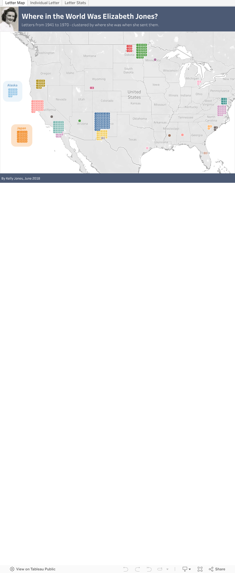
This was an individual learning project for Metis, my data science bootcamp. I created an original dataset by digitizing my grandmother's letters from the 1940s, '50s, and '60s. The visualization portion of the analysis focused on mapping because my grandfather was in the Air Force and they moved more than 30 times during their marriage. The simplest route would have been to put a single dot in each location, sized by the number of letters sent, but I wanted individual dots per letter with the opportunity to include metadata like the year or the recipient. After much experimentation, I figured out how to “jitter” the points on a waffle chart. I also parked Alaska and Japan off the coast of California so everything fit in a single view.
Additional links: Waffle chart tutorial | Presentation slides | GitHub repo | Transcribing cursive handwriting